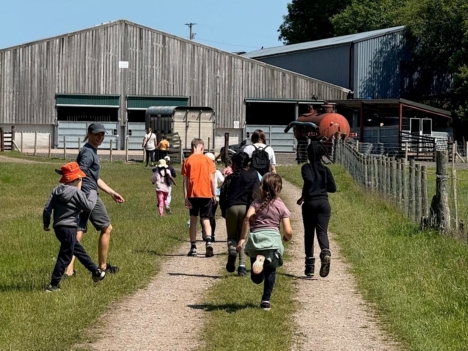
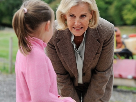
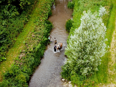
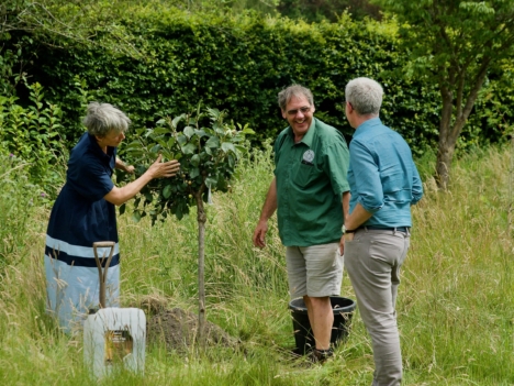
This week I saw two things in the same hour… real close-up photos of nature shared by Park View 4 U (a charity community park) and a think piece why all our content and creativity online looks kind of the same (partly blamed on the “AI slop economy”).
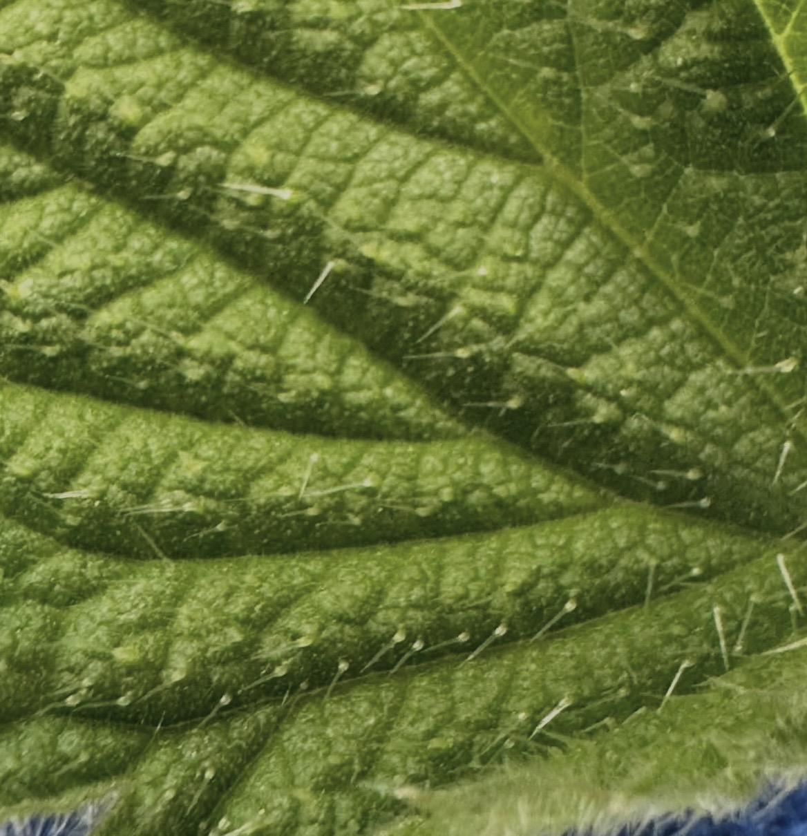
Looking back at the photos of insects and leaves (and more importantly, the children gazing at them with interest and joy) I was struck by the two different views of the world. One rich in diversity and a complexity that can only be seen with a magnifying glass. And one that has allowed simplification and homogenization to be the ultimate goal, in a relentless drive towards economic efficiency.
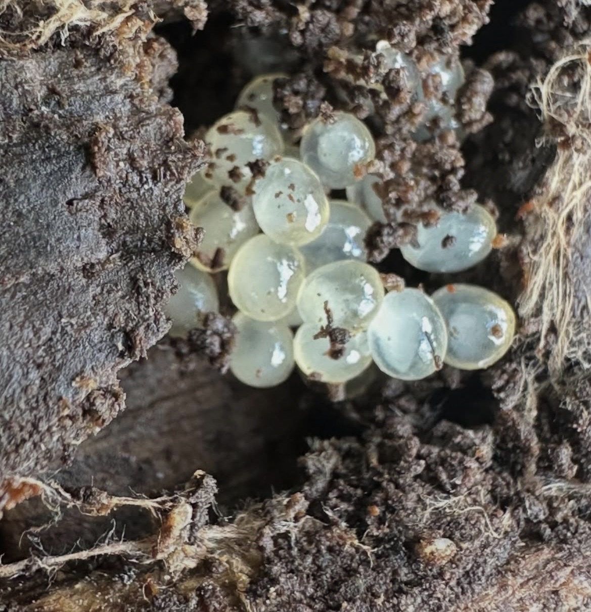
Photos courtesy of Park View 4 U

Photos courtesy of Park View 4 U
And because I work in Comms and we’ve just launched our rebrand, my trail of thought wound its way over to our organisation and my relief that we have aligned ourselves with the former – both subconsciously and deliberately.
Did you know that the apple logo used to be multi-coloured? For twenty years the brand now defined by grey chrome was a rainbow-striped apple. It’s not the only one – there’s an overwhelming shift in design today towards minimalism, monochrome, simplification. It’s something we see in brands, furniture, architecture all over the place – the phenomenon really emerged about 10 years ago when every tech company was rebranding to simplified fonts and logos, but the trend originated long before then and has continued well into this decade.
And it’s taking all the joy out of the world we live in – that’s my opinion, but I don’t think it’s a controversial one and it’s shared by many others who have written really thought-provoking pieces on what this means for our cultural economy. To pick on some immediately visible and local examples… ornate red iron phone boxes are now grey glass booths. Carved stone around cottage mullion windows have become straight uPVC lines. Even standard farmhouse tables and chairs traditionally have spindles and decoration that are lost in their mass-produced equivalents today. When we see this trend online, it’s tempting to blame AI-generated content – but all of these examples massively pre-date AI. They’re decisions made in a bid to save money and time, making things more “efficient” – and AI’s method of copying and flattening what already exists just democratises the process and makes it worse.
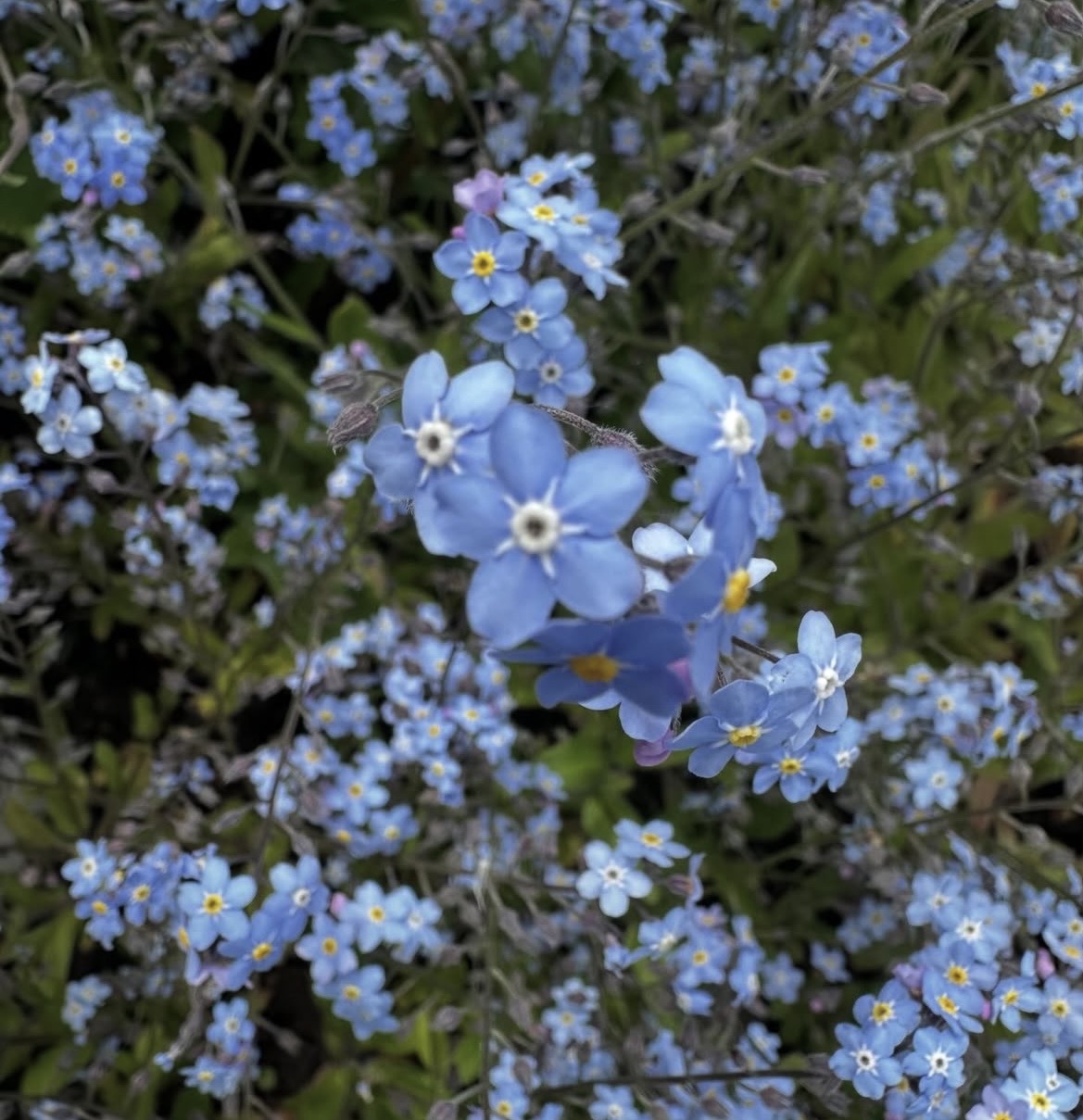
You know where you don’t see a trend towards minimalism? In nature. Even as it evolves, the natural world always showcases the beauty that complexity, diversity and detail has to offer. No grey monotone palettes here – the trees, fields and gardens around us are bursting with a million different shades of green (and every other colour you can imagine!).
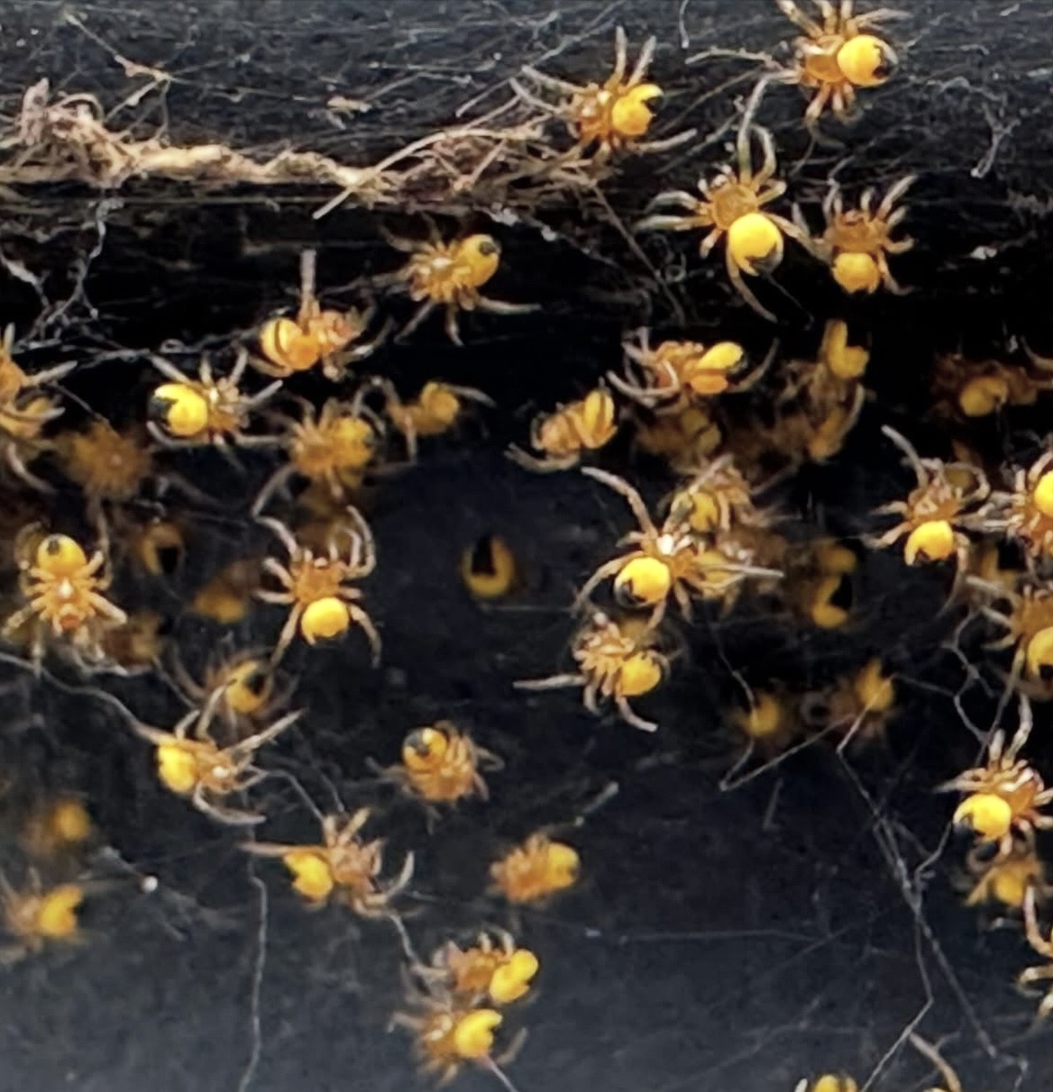
Photos courtesy of Park View 4 U
This was the inspiration behind our rebrand. If our goal, our whole purpose, is to connect people with the outdoors, then we knew we couldn’t do that with a pared back minimalist brand! No trends towards capitalist efficiency or mass-produced templates here…
So we bucked the trend of simplifying perfectly good logos (like everyone from Burberry to Burger King) and embraced our existing logo. Complex as it is, it captures not just our name but the logomark in the middle echoes a sprout, butterfly or owl depending on how you look at it. A bit like our very own Rorschach test!
We worked with the brilliant agency UnitedUs and they came to us with some beautiful suggestions for our fonts. It would definitely have been easier to stick with Arial, but we knew we wanted something that captured the land and learning of our organisation. We chose Moret, which not only has organic flowing forms that blend seamlessly with nature, but it has a shape and curvature that suggests it could be carved into wood by hand. It echoes not just the natural world but the land-based skills, human connection and craftsmanship that are an equal part of our heritage. And in a world of sans serif fonts (for those with less geeky interest, that means without any flicks on the ends of each letter!) it felt like a small act of resistance to embrace a font with some character! (A little pun for those with geeky interest!)
Photos courtesy of Park View 4 U
And to come back to the now flat grey Apple logo… we knew there would not be not be any chrome greys or monotones in this iteration. If anything, the challenge was restricting ourselves to just a few colours from nature. A green so dark it’s almost black, paired with a green so bright it’s practically neon, and complemented by an off-white that’s warm enough to come from nature, felt like the perfect balance. The tech companies would probably shudder to see the lack of silver and black in our palette – but that’s kind of the point.
In a world of chrome Apple products we’d rather take inspiration from the speckly Braeburn or vibrant Pink Lady!
Photos courtesy of Park View 4 U
Our next step, which we’re exploring slowly and intentionally, is how to incorporate illustrations and drawings created by real people in nature to our brand ecosystem. If you know anyone or have any ideas of how we can work with local communities on this, we’d love to hear from you (email hello@ernestcooktrust.org.uk and ask for Isobel!)
A final word on brand… At the Ernest Cook Trust we believe that no logo, font or colour combination means as much as how you experience our organisation on the land and with our people. Or the impact we have on the environment. If you see old logos, clothing, signs or branding out in the real world it’s because we don’t believe in replacing perfectly usable products and sending the old ones to landfill just so everyone has the same shiny logo on their jacket. As and when these need replacing, we’ll roll out newly branded replacements – and if you see anything that you think needs our attention please let us know. But if it’s doing the job, our priority is connecting people with the outdoors and supporting connections to thriving land – whatever they’re wearing!